Introducing Ververica’s New Brand Identity
Today we are extremely excited to introduce our new visual brand identity for Ververica and our products, such as Ververica Platform! This has been in the works for many months, and a project we embarked on earlier in the year. We are moving with the flow in an ever-changing and constantly-evolving space of stream processing and real time data! What our new visual identity brings to the table, and how did we get to the final design? Read on for a deep dive into how we made this happen!
A redesigned logo for Ververica
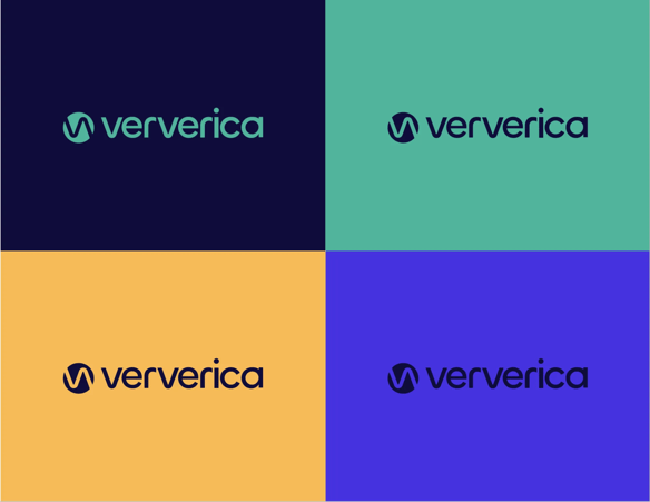
We introduced an updated version of the Ververica logo that showcases and highlights the letter V (shown twice in our brand name). The redesigned logo brings a sense of stability, innovation, and continuation to our brand mix, all of the aspects being represented in the products and services we offer to existing customers and plan to offer in the future. As for the name, this has remained the same. If you are wondering what the Ververica brand name stands for, you can take a look at our previous story here.

Our redesigned logo has been designed based on the features of the letter ‘v’ in the word-mark.
An updated colour palette for Ververica’s visual identity
The updated colour scheme for Ververica brings four colour variants to the table — all illustrating our history (the petrol colour of our previous visual identities) as well as an element of change and evolution of our brand and what we stand for as a business, now and in the future. The stream processing space is evolving fast as both Apache Flink, and other technology frameworks mature and expand beyond their original scope, and new features are added to stay relevant for the data processing needs of the modern enterprise and grow the adoption of real time data and event driven applications across the globe.
Our redesigned website and new visual identity come hand-in-hand with this growth and evolution in our space, bringing a sense of freshness, lightness, and metamorphosis to the table.
When streams — and waves — represent what you do!
The main theme of the redesigned visual identity for Ververica evolves around waves 🌊🌊🌊😀😀. And why is that...you may ask? Ververica has always been focused on providing innovative, state-of-the-art technology solutions around stream processing and (near) real-time data analytics for the modern enterprise. A big part of that and how we see the world of stream processing — with Apache Flink — is an omnipresent, uninterrupted flow of information and huge amounts of data. This flow needs to be processed at extremely low latency, high throughput, and with the highest correctness guarantees to ensure that the modern enterprise can act in that very moment and have the appropriate insights to make the right decisions. Similarly, waves and streams in oceans or rivers flow without stopping and bring fresh elements to the table. This is what we want to illustrate and highlight with our renewed visual identity.
Much like the waves never stop hitting the shore, we see data and information needing to be processed in real time in order for stream processing to make sense.

We are beyond excited about our redesigned visual identity and cannot wait to showcase all the elements of our identity to you through various events, communications, and interactions! A huge THANK YOU to our marketing team for making this happen and working countless hours to bring the end result to our users and customers!

You may also like
Meet the Flink Forward Program Committee: A Q&A with Lorenzo Affetti
Meet Lorenzo Affetti, a Program Committee member for Flink Forward 2025, ...

Outrun Fraudsters with Agentic AI and Ververica
Enhance fraud detection with agentic AI and Ververica's real-time stream ...
KartShoppe: Real-Time Feature Engineering With Ververica
Discover how KartShoppe leverages Ververica’s real-time feature engineeri...
Maximize Efficiency: How Ververica's BYOC Deployment Optimizes CAPEX and OPEX
Learn how Ververica's BYOC deployment leverages CAPEX and OPEX to optimiz...


